
There’s no prediction like Pantone to keep things on point; we’ve been anxious and excited to get the latest Pantone seasonal forecasting and enjoy the top colors in the wake of New York Fashion Week—and they’re finally here!
Pantone Flashes
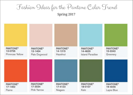
Judging by what we’ve seen on the catwalks, the leading colors are Primrose Yellow, Niagara and Lapis Blue in the top three slots respectively, followed by Island Paradise and Flame. Then, we’ve enjoyed Pink Yarrow, Pale Dogwood, Kale, Greenery and Hazelnut and what we can tell so far is that, despite the ranking, all 10 colors are going to work their way into our winter/spring wardrobe, interior design and all other aspects of our chic lives.
Pantone’s colour analysts have explained that this time around, the Pantone color pallet is all the idea of transitional seasons and season-atypical options.
Exploring the Color Palette
Thanks to the color-predicting wizards at Pantone, we now know we’ll be going crazy over these ten hues in the near future, and they’re all more fabulous than the other (or even equally fabulous, we’re still unsure).
Fashion Inspiration Based on the Pantone Color Trend

Here is a foresight into the palette of our fashion future:
Primrose Yellow 13-0755
This rich sunlight color is akin to flowers and reminds us of nature; it feels fresh but with a superb, toned retro vibe. We’ve seen designers mix it with the cooler Island Paradise and warming Hazelnut, which was very interesting to see.
Niagara 17-4123
Relaxed, comfortable, and dependable, this denim-like blue was Carolina Herrera’s choice for a ballgown, as it was in translucent detail on a gown by Zac Posen and in a floral-printed denim jacket by Joseph Altuzarra. The color’s already a standout and it just came out!
Lapis Blue 19-4045
This time around, Lapis Blue is in the role of bringing in a bit more vitality; the color itself is very energetic with an inner radiance, and it possesses a quality of pearlescence that enhances any layering effect. This blue is nothing about the same old blue sameness; it’s more about excitement and innovation – and we loved it!
Island Paradise 14-4620
Yet another blue but with a different twist, this Island Paradise spoke to Victoria Beckham’s creative genius, making her use it in panne velvet dresses; the color alone made one feel it was spring and we could see the audience smiling. That’s what Pantone is all about, from the get go! Different to Beckham’s take, Lela Rose used the hue in a lace dress as did Christian Siriano (although Siriano combined fiery Flame with the light blue).
Flame 17-1462
This red-fused orange is a show-stopper; it’s vivacious and gregarious, and has an indescribable drama about it. Wear it and be sure you’ll be turning heads when you walk into a room. Lela Rose, Rag & Bone, Gabriela Hearst and Tory Burch warmed up to it perfectly.
Pale Dogwood 13-1404
Not really an extension of Rose Quartz but very similar in vibe, Pale Dogwood is all about lightness and airiness. Designers like Baja East, Lacoste, J.Mendel, Banana Republic and Ryan Roche worked it into their collections superbly.
Naturally (as expected) not all designers loved the easiness of this hue so we weren’t that surprised to see that forever-chic Saint Laurent kept things sleek and toned down. This Fashion Week, women’s Saint Laurent clothing dominated with black and white hues, and we obviously had a major jaw-drop moment. Sorry, Pale Dogwood – we love you, too.
Greenery 15-0343
This yellow-green and its partner Kale obviously stand for shoppers’ longing for the great outdoors; Trina Turk, Zac Posen and Cynthia Rowley all had a dose of Greenery. Michael Kors also turned to sweet greens, although his approach was more on point with the mix of Island Paradise and Lapis Blue.
Pink Yarrow 17-2034
Festive and visible, yes. Kith and Nanette Lepore made it pop beautifully on the runway.
Kale 18-0107
Aside from complementing so many other colors, this Kale color introduces a breath of fresh air. It’s bringing an air of ease and calm, and we love everything about it.
Hazelnut 14-1315
Neutral and ultra chic, Hazelnut is a transitional color that can actually be worn all year round. Dennis Basso worked it into a short lace dress and chiffon blouse. It’s spectacular.
We are excited for the upcoming styles that are going to rock these colors, aren’t you?
Disclaimer: This post contains affiliate links.


Leave a Reply